One of the many things I love about printmaking is the challenge and adaptions involved in making and following a plan. I have spoken before about the delicate balance that must be struck in creative printmaking between dull ‘mechanical’ reproduction of an image and the uncontrolled ‘happy accident’. With the way I tend to work - with layers and reductions, and all sheets of paper in the planned edition being worked on at once; there is usually no going back once the process has begun. So nearly all my prints need to have some sort of a plan. However, most printmakers will agree that the end result is not always quite what was expected.
Some prints do pretty much as they are asked to do and help me to a result which I’m either pleased with or not. Probably because my initial plan for this latest one was a little vague, it resisted success right to the end! So I thought I’d just put some detail to the stages of making it.
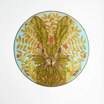
The idea came from my ongoing interest in a mix of images and symbols from mythology and folk/ancient religion: Hares (and especially their eyes) and witches; the so called Greenman or ‘Jack in the Green’; the changing seasons and significant times such as the Celtic Samhain autumn festival; ‘sacred’ trees such as oak and rowan etc.
I couldn’t recall seeing the sprouting face image of the Greenman being applied to an animal, but the spiritual brown hare seemed a good choice to try it with. And having previously made a connection in another print between the coming of spring green in the woods and a witch; and as it was the end of October and the woods full of colour ….things began to come together.
Some prints do pretty much as they are asked to do and help me to a result which I’m either pleased with or not. Probably because my initial plan for this latest one was a little vague, it resisted success right to the end! So I thought I’d just put some detail to the stages of making it.
The idea came from my ongoing interest in a mix of images and symbols from mythology and folk/ancient religion: Hares (and especially their eyes) and witches; the so called Greenman or ‘Jack in the Green’; the changing seasons and significant times such as the Celtic Samhain autumn festival; ‘sacred’ trees such as oak and rowan etc.
I couldn’t recall seeing the sprouting face image of the Greenman being applied to an animal, but the spiritual brown hare seemed a good choice to try it with. And having previously made a connection in another print between the coming of spring green in the woods and a witch; and as it was the end of October and the woods full of colour ….things began to come together.
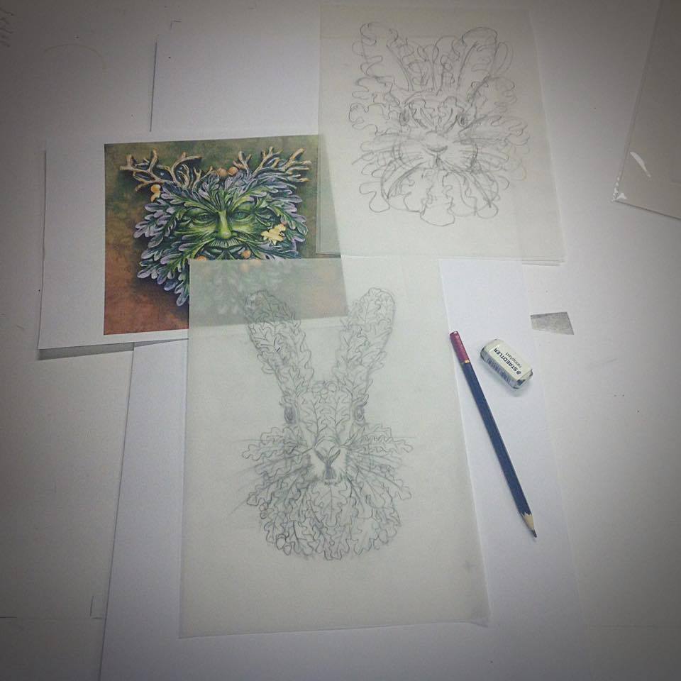
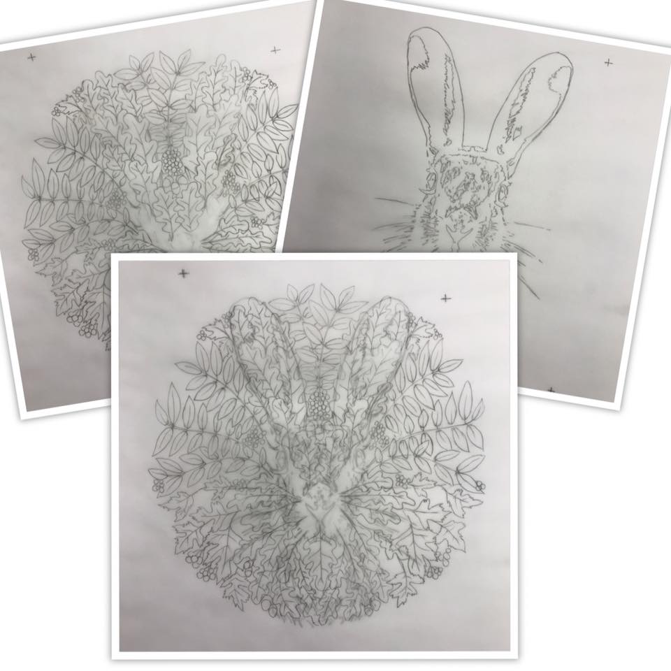
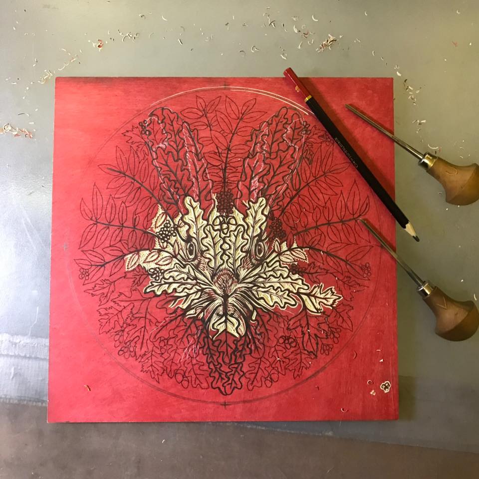
Although in the initial stages I nearly always use computer graphics to enlarge, copy, distort and compose basic shapes, there is no substitute for drawing and eventually I had a key outline worked out.
The initial plan was really quite straightforward: I would cut a ‘key’ lino block design which would print in one dark colour (not just black - it can be so deadening) and ‘colour it in’ using simple screen-print stencils. Indeed I was thinking at first of an almost ‘stained glass window’ quality.
Even with a proposed simple image like this (at least in terms of texture and line, if not content) I prefer to use a fairly sketchy tracing; then allow the process of carbon paper transfer, plus use of a soft pencil and then the actual ‘drawing’ with the gouges to dictate the final line and shapes. This, rather than mechanically traced and carved dead line, gives some life to the image.
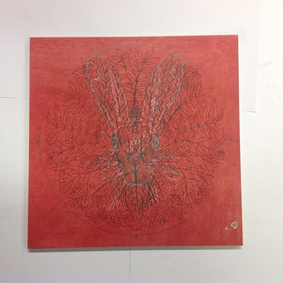

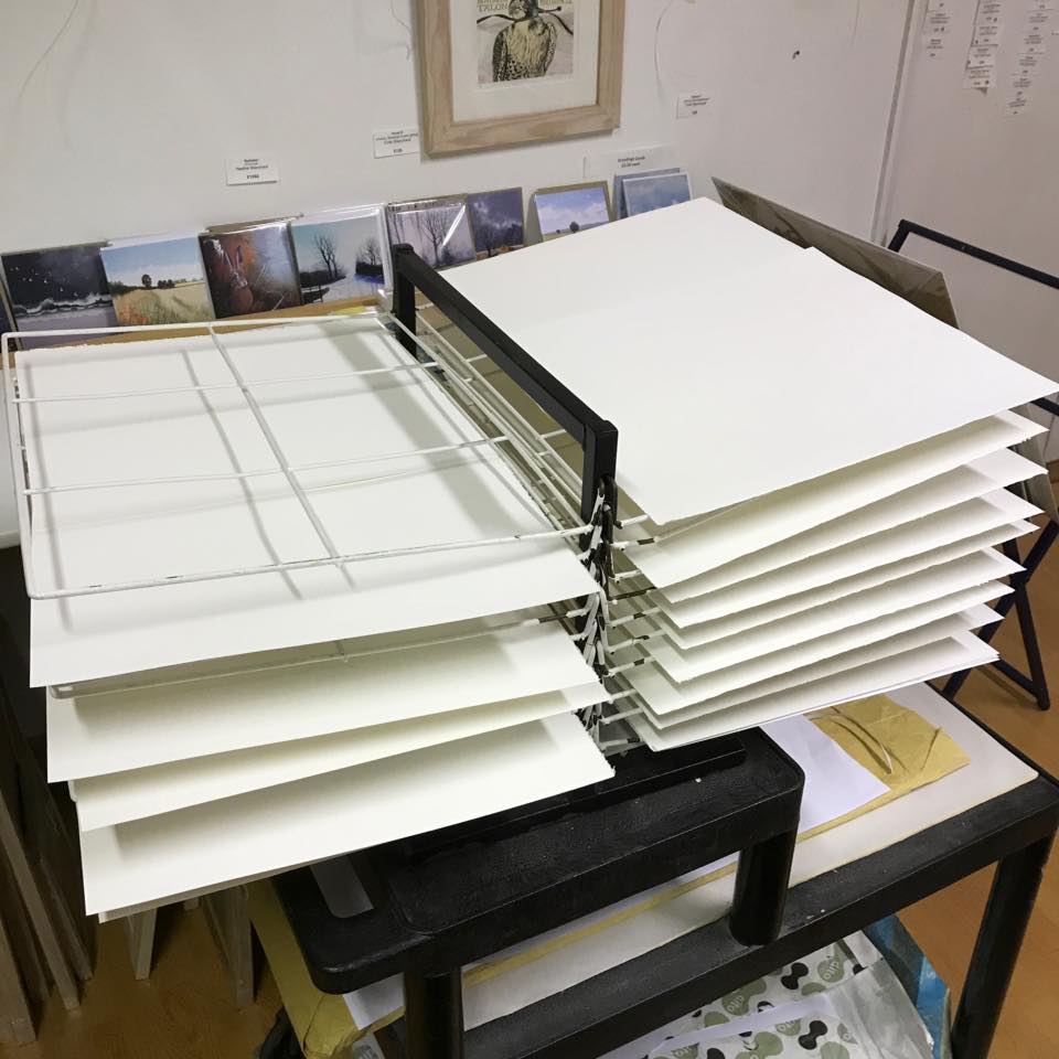
At this stage – although clearly the image was a bit strange and not really quite what I usually do (we all must move on!) I thought it was going to be straightforward. So having completed the carving - and during the time it took to do so, acclimatised the paper (temperature and humidity can seriously affect register) I took four proofs in a dark brown/black; in register to one corner, using standard stop tabs rather than TB pins; because the main layers of this print were to be screen printed.
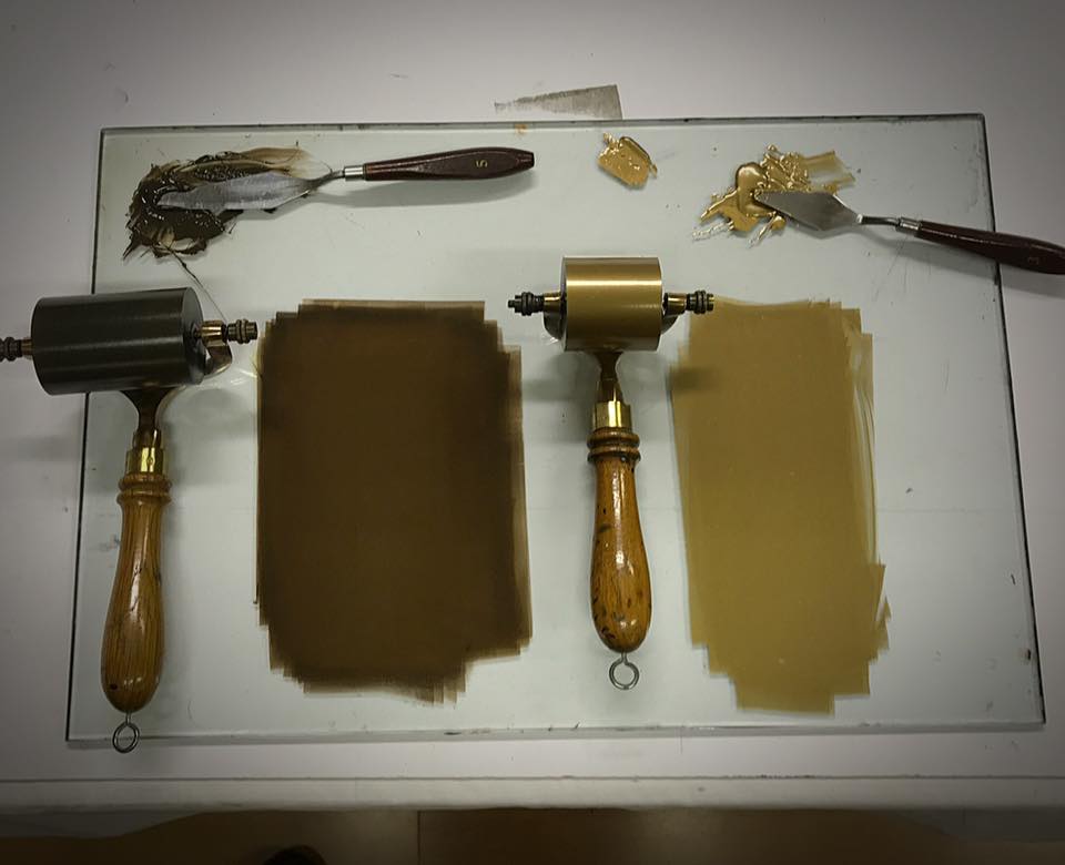
I then used one of these proofs to trace and paint out, with Lascaux screen filler, the first few screen stencils. These were overprinted on top of the lino proofs, as well as on to the 25 + sheets of my usual 300 gsm Somerset paper.
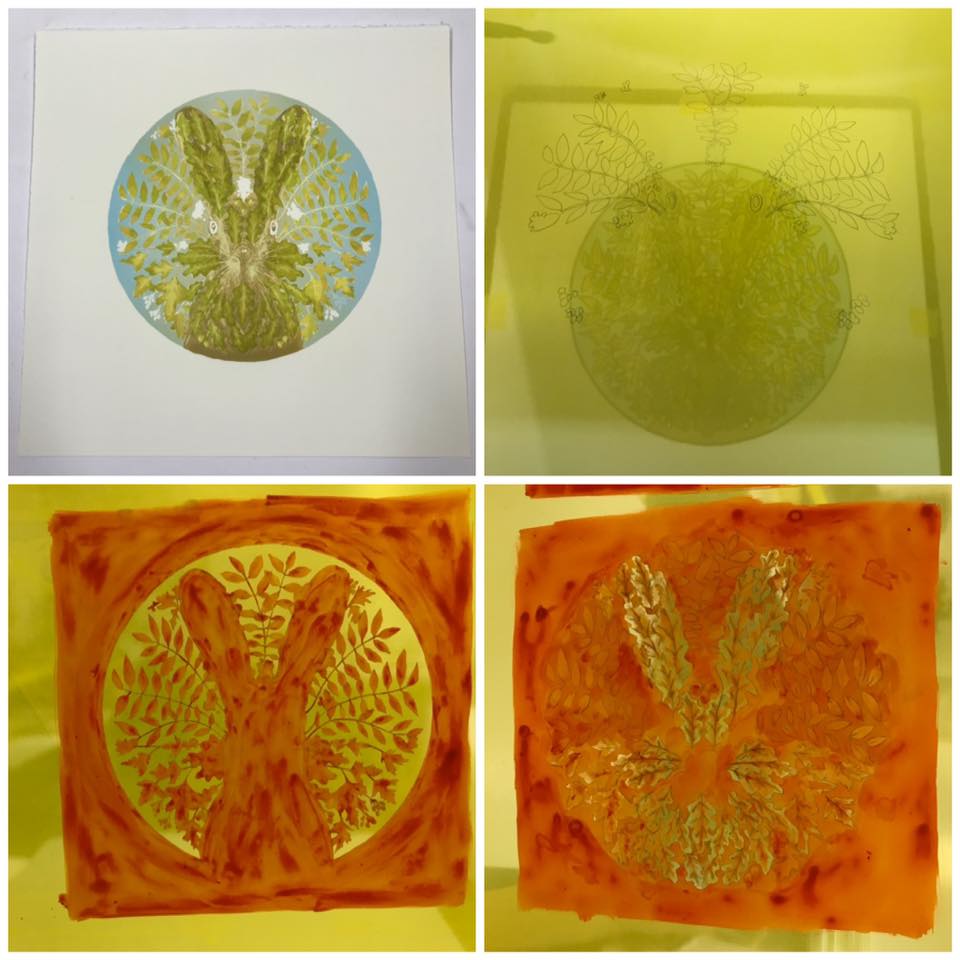

It was then I realised that the original plan was not going to work! The very strong lino image, if printed like this on top of the final screened colours was going to kill any colour and subtlety in the print. Not only that, but I was also beginning to enjoy the subtle autumn colour effects of the blends and transparencies achievable with screen inks.
So by now I was a bit lost. What to do? The pile of expensive paper was already printed with several screen printed layers. I had spent a long time finalising the composition and even longer carefully carving the lino block, the register of which image only just fitted the the colours already printed on all of the paper.
My wife is a painter (and a brilliant and successful one at that). We share our big studio and of course often consult each other. She often says “this one’s fighting me” about her paintings. So she was sympathetic to my battle and brought a painter’s eye to the job. “Just emphasise the hare” she said. “leave the bits on either side they’re OK as they are”
She was right of course. So I first of all attacked the lino block and thinned all the printing lines down as far as even the Marmoleum lino could take. I had to then accept that they would not necessarily match exactly with the screened colour. Didn’t matter! I went to town on the remaining screen colours; using very thin filler, and free brush marks plus blended inks to create autumnal richness and light.

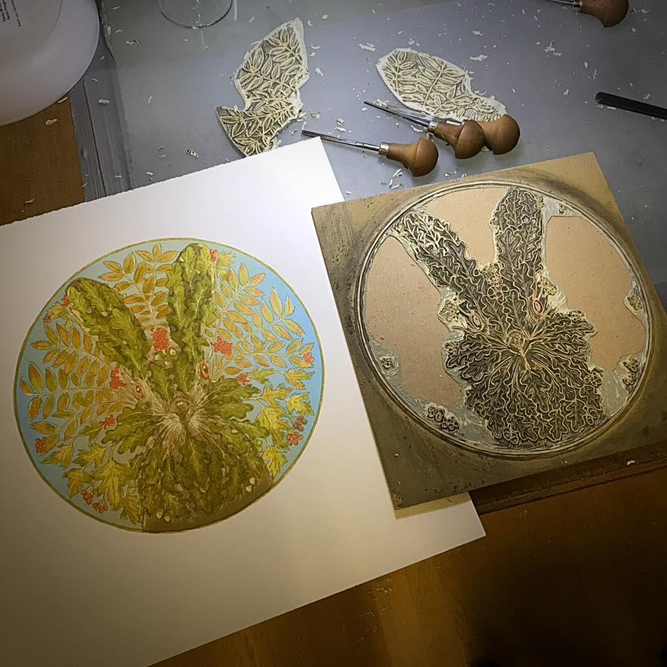
After that it was a fairly simple job – by making the overprinting of the lino block on top of the colour into a three stage reduction process - to turn what had been a big lumpen lino image into something more like the lighter over-drawing and tracing I had begun with.
The final dark details and the gold ink outer circle were printed in one pass ….and the battle was won!
The final dark details and the gold ink outer circle were printed in one pass ….and the battle was won!
 RSS Feed