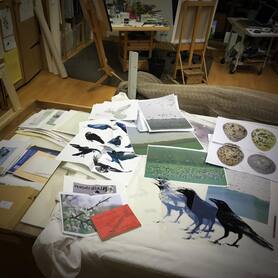
It all began with a tidy up of the ‘ten a penny’ drawer: the place I stick bits of ideas and reference and half plans. It was a very productive session. From the depths came a set of film positives I’d made some five years ago – four tonal separations from a digitally created image of a raven; a time when I was working in a slightly different style.
The other little exploration I’ve been working on lately was trying out some amazing 650 gsm Somerset paper I was offered by Lawrences – actually at the same price as my usual 300gsm, which I love. I tried some deep embossing with lino of it on a wee print (‘Early April’) which was very successful; and I will (one day!) get round to trying it with very deep etched intaglio.
However, there is one thing that the lighter 300gsm doesn’t do too well; and that is taking several layers of large flat areas of water based screen ink. It does tend to ‘cockle’. Just a little, and with some prints, especially those I like to ‘float mount’ that is fine. But, I thought, this 650 is the stuff to try!
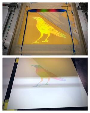
So away I went …. First with some early blended layers of transparent primary colour. (Permaprint Premium in my own cocktail of clear base; 140T mesh)
Usually with my work, I at least have a clear ambition, if not an exact plan, as to where to go. This time (although I am no painter) it felt like just laying down some underpainting on a basic composition and allowing the image to build.
Fairly quickly, two thoughts occurred. One: The image needs strengthening. Two: Iridescence!
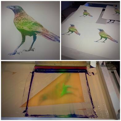
The iridescence was largely a matter of the straightforward control of the many colours and directions of the blends.
I knew if I kept adding layers of colour, eventually I might get a ‘black’ bird that wasn’t black.
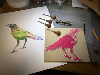
One option was to create some more hand drawn photo positives and keep the whole thing as a screen print. I decided though that a lino block was the answer.
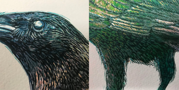
The surface textures of tacky ink on this slightly rough paper and the versatility of inking with several rollers over a three stage reduction would surely give me a bonus of colours as well as graphic definition. I’ll be honest though. It also sounded like good fun!
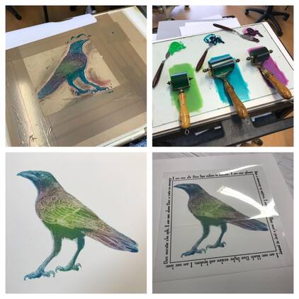
On a print this size, through the etching press, the pins and tabs on the leading edge not only accurately register each sheet, but help to prevent paper shift under pressure.
As long as my tracing down on to the block had put the basics all pretty much in the right place, I wasn’t too worried if the digital screenprint textures of the feathers matched my hand carved lino ones. In fact I knew they wouldn’t, and hoped that would add further textural/colour layers to the image.
So, again much like building up a painting, I began to put down thin blended layers of Caligo Safewash; reduced 50 to 80% , and carefully applied to the required areas as consistently as possible using small rollers.
This took three stage reductions of the block; and although it sounds long winded and laborious, by now I was ‘in the zone’ and working almost instinctively. I also carefully ‘touch dried’ each layer with a dusting and wiping with cornflour; so by the time I’d carved the next stage – usually the same day – I could get on and print. The layers of ink were very thin and the pressure was kept low, because the slightly textured paper was giving me some really fascinating ‘iridescence’ textures.
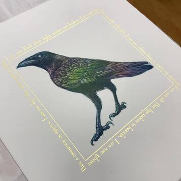
Also whilst printing the lino stages, I put some thought to how I might include some words that had formed in my head whilst reading again many of the mythologies and references to Ravens. Having also recently replaced my way out of date bits of gold size materials and bought some new transfer 23ct gold leaf, it was clear that this strong image would carry the application of gold to add the words and frame the composition. It would also add another experiment to this most experimental of prints. So a simple film positive was made in preparation; using photoshop elements and a slightly altered, but appropriately named ‘Beowulf’ typeface.
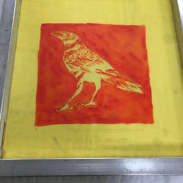
The idea being to just tint some areas and ‘bring up the contrast’ of the whole thing.
And eventually I was pleased that had more than met a target that I didn’t even know was going to be the target when I started!
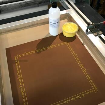
The chemical/molecular reaction of the three was quite extraordinary. A paint/ink scientist could probably tell me what was going on, but very quickly it first split; and then like a mayonnaise rescued by beating, gradually thickened to a gelatinous texture.
I thought this was actually too thick, so added some more size. This just seemed to set the jelly even more!
I suspected though, that as it loosened up with stirring, this thixotropic property might be just right for screen printing: Under the pressure of the squeegee through the mesh it would be fluid, but stay nicely ‘plump’ on the absorbent paper to receive the gold leaf.
Printing as normal through a 120 mesh I tried a quick test on scrap pieces of the Somerset paper. I tried single, double and treble pulls, just to see if a slightly thicker deposit made a difference to the required ‘tack’. It didn’t really. The gold leaf sticks to anything! Including any areas of printing ink on the image itself that are not completely dry! But I thought a double pull would just make sure there was no patchiness.
By now I was down to about a dozen perfect and consistent prints on the best paper, plus proof sheets and slight colour discrepancy ones.
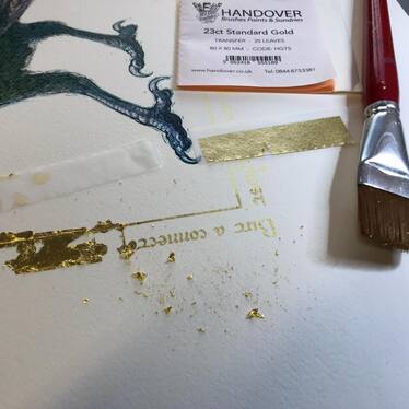
So, feeling confident, I printed the full poem on four perfect prints, let the size/ink dry for about two hours and set to with the task of applying the expensive leaf.
A firm press with a finger and a firm but careful removal of the excess with a soft large watercolour brush, followed by a burnish with a soft cloth is all that is needed.
I dislike the phrase because it implies that the artist had no control whatsoever.
For me, the only really interesting original prints are those with qualities not obtainable by other media.
But I’m sure that virtually every creative original printmaker, even those with supreme control of their techniques, gets huge pleasure from those moments when you rely on the block, plate or screen and its ink to give what IT decides it will.
So although unplanned at the start, this image was certainly not a happy accident - but a series of controlled surprises!
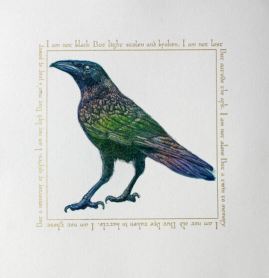
Song of the Raven
I am not black
But light stolen and broken
I am not lost
But outside the ark
I am not alone
But a twin to memory
I am not old
But life taken in battle
I am not ghost
But a connector of spirits
I am not bird
But man’s fear of power
 RSS Feed