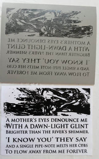
Perhaps it’s the shortening days, but well – here I am after several months away from writing blog posts. I will try harder!
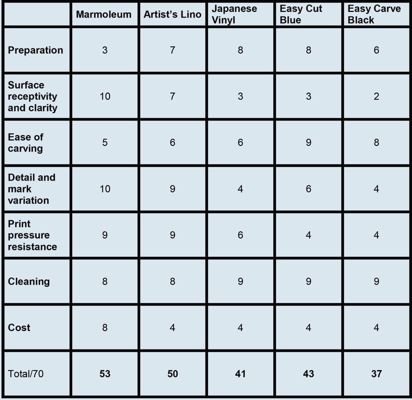
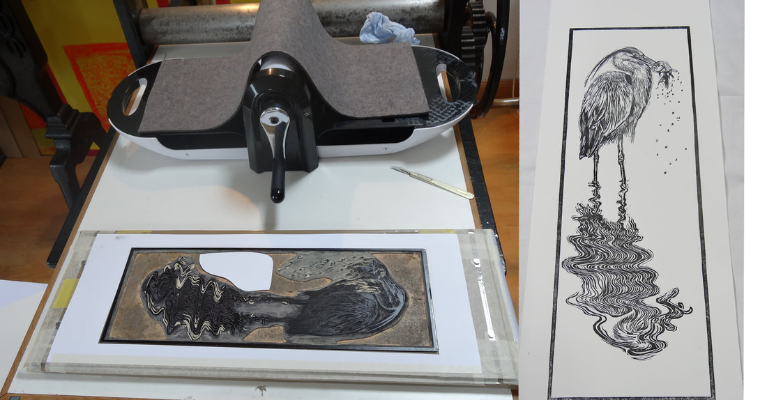
I have written before about my preference for using Marmoleum commercial flooring lino for my linocuts. It is a little thinner but much firmer than anything else available; crisper and more durable, but still carves like butter when warm. It does require some preparation before use, but like many similar tasks in printmaking, I have to say I quite enjoy the process of turning a sheet of flooring into a lovely firm prepared printing block.
I like a light coloured lino (white would be good, but they don’t make it); the surface of which I can stain (usually red). This is in order to be able to both draw on the surface with pen and pencil and then be able to clearly see the cut marks I make in positive - i.e. how they will print.
Two years ago I bought, via my local carpet shop, a 2m wide roll of the then palest cream colour Marmoleum I could find. I chopped it into large pieces and stored it flat. I have now used nearly all of this and the remaining pieces seem to have begun to harden; which of course will happen if stored where the linseed oil used to make it can dry out.
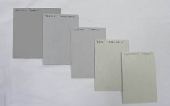
An initial search showed that in the meantime, Forbo the international company that manufactures Marmoleum, had not surprisingly, updated their range. Forbo and their suppliers are very good at providing samples, so after a little research I ended up with four pieces of the palest colours I could find. They were: Real ‘Edelweiss’; Concrete ‘Moon’; Walton ‘Titanium’; Fresco ‘Moonstone’.
I have written before about my preference for using Marmoleum commercial flooring lino for my linocuts. It is a little thinner but much firmer than anything else available; crisper and more durable, but still carves like butter when warm. It does require some preparation before use, but like many similar tasks in printmaking, I have to say I quite enjoy the process of turning a sheet of flooring into a lovely firm prepared printing block.
I like a light coloured lino (white would be good, but they don’t make it); the surface of which I can stain (usually red). This is in order to be able to both draw on the surface with pen and pencil and then be able to clearly see the cut marks I make in positive - i.e. how they will print.
Two years ago I bought, via my local carpet shop, a 2m wide roll of the then palest cream colour Marmoleum I could find. I chopped it into large pieces and stored it flat. I have now used nearly all of this and the remaining pieces seem to have begun to harden; which of course will happen if stored where the linseed oil used to make it can dry out.
An initial search showed that in the meantime, Forbo the international company that manufactures Marmoleum, had not surprisingly, updated their range. Forbo and their suppliers are very good at providing samples, so after a little research I ended up with four pieces of the palest colours I could find. They were: Real ‘Edelweiss’; Concrete ‘Moon’; Walton ‘Titanium’; Fresco ‘Moonstone’.
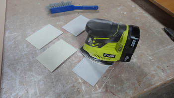
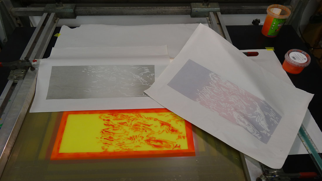
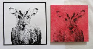
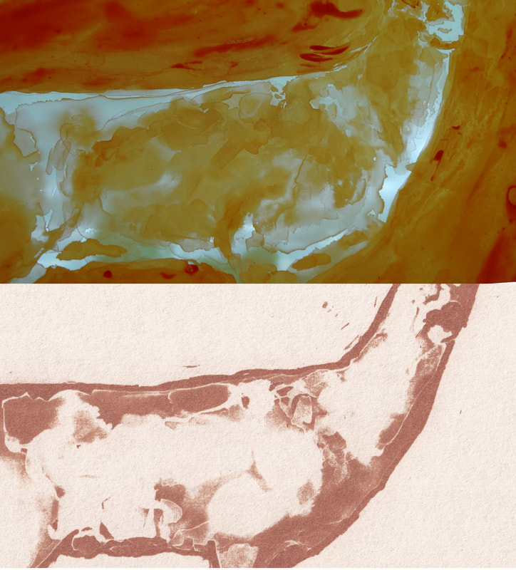
All Marmoleum comes with a semi shiny and very slightly textured surface. So as normal I then lightly sanded the surface with a fine grit paper until the satin gloss and slight texture had visibly gone.
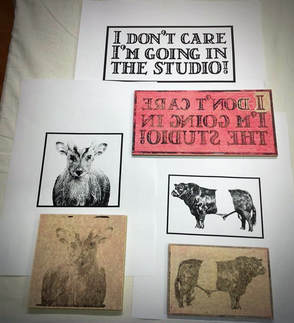
I had cut the generously sized samples into four small blocks (small enough to also enable me to test another little ‘mini press’ I’ve been asked to look at – watch this space!)
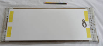
I mounted these on to 3mm hardboard/Masonite with carpet spray glue.
I had cut the generously sized samples into four small blocks (small enough to also enable me to test another little ‘mini press’ I’ve been asked to look at – watch this space!)
I mounted these on to 3mm hardboard/Masonite with carpet spray glue.
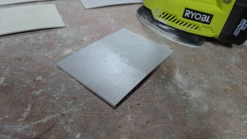
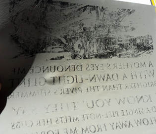
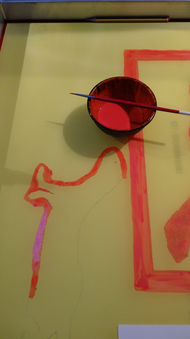
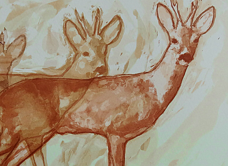
This leaves a lovely matt surface, which, when stained with a thin coat of acrylic ink, is perfect to draw on both with pen and pencil and to transfer images to with carbon paper etc.
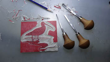
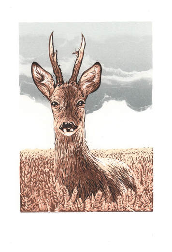
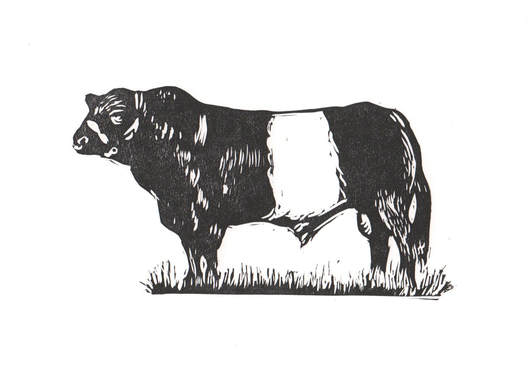
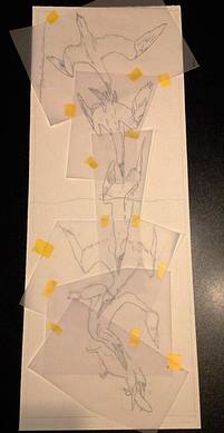
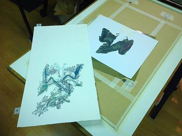
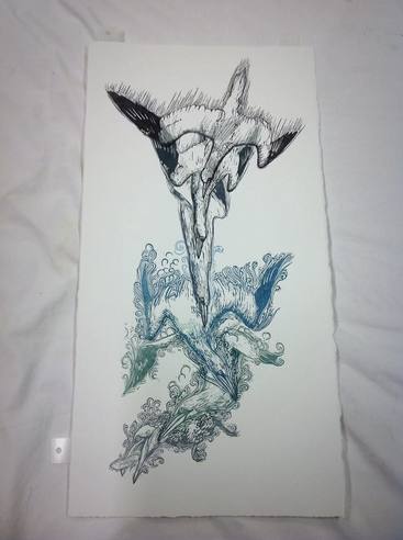
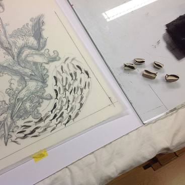
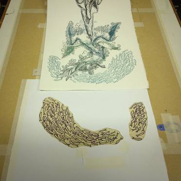
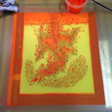
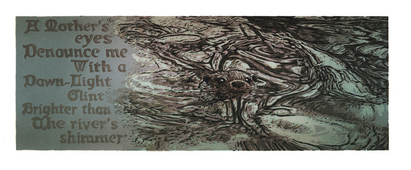
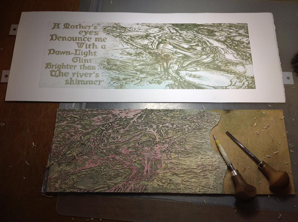
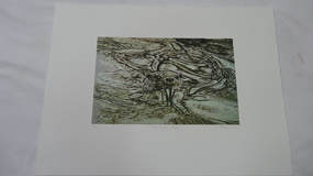
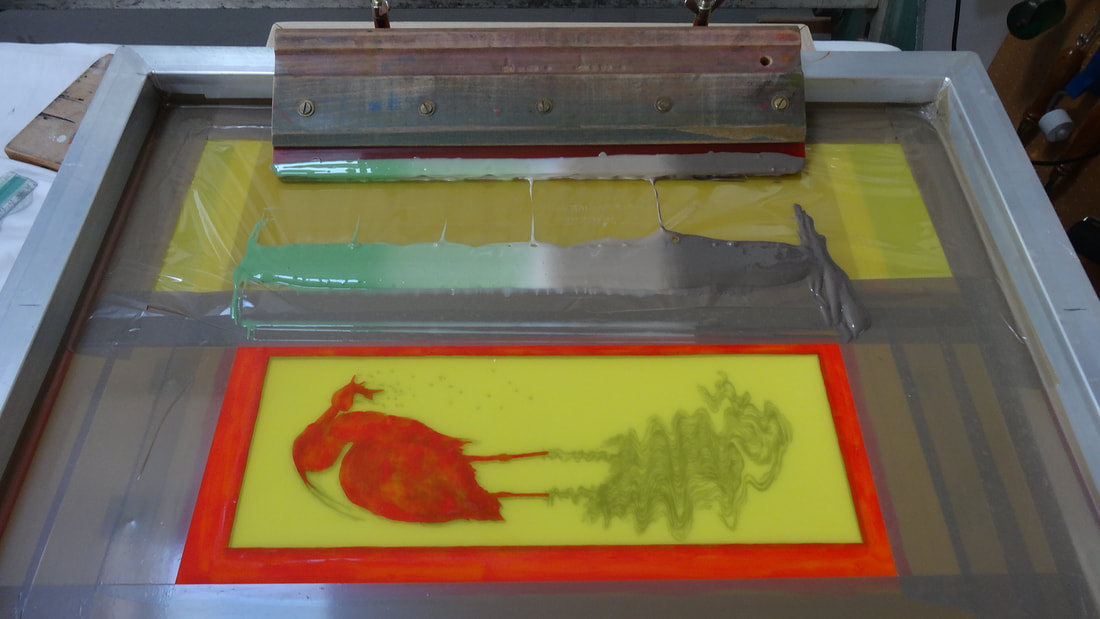
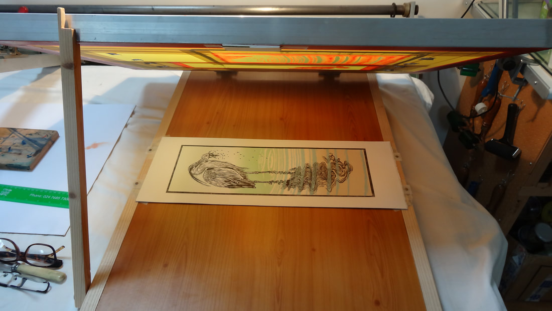
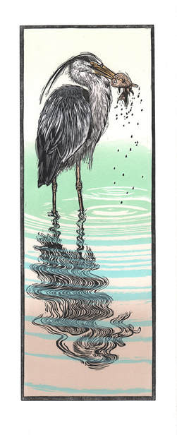
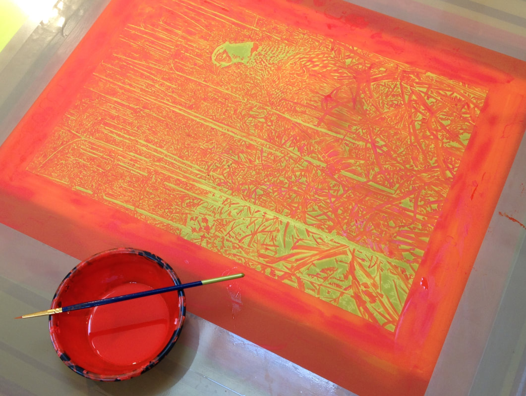
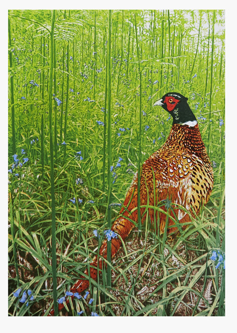
So I proceeded to do just that - and then set to work with the gouges. This was of course the crucial test to decide which one of the four gave me the best tonal contrast with the surface and its guidelines. The small scale work required by these little images also helped to illustrate the fine detail that is possible with crisp lino and a clear idea of how the cut lines and textures will print.
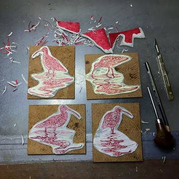
There was actually very little to chose between them. All were paler and therefore preferable to the grey of ordinary ‘artists’ lino; which, as I have written previously is perfectly good if you do not want the trouble of preparing and mounting your own blocks.
The two best both have a slight ‘ripple’ colour to them; whereas the ‘Titanium’ is plain. This makes no difference at all when carving. All have a slightly darker under-layer, which is useful as a guide to your depth of carving.
So the verdict?
P.S.
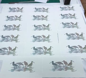
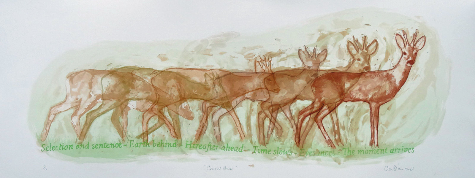
I am still in the process of making a small edition from these four little blocks, which will appear in due course!
The two best both have a slight ‘ripple’ colour to them; whereas the ‘Titanium’ is plain. This makes no difference at all when carving. All have a slightly darker under-layer, which is useful as a guide to your depth of carving.
So the verdict?
- ‘Real’ range ‘Edelweiss’ Code: 3257
- ‘Concrete’ range ‘Moon’ Code: 370135
- ‘Walton’ range ‘Titanium’ Code: 336935
- ‘Fresco’ range ‘Moonstone’ Code: 3883
P.S.
I am still in the process of making a small edition from these four little blocks, which will appear in due course!


 RSS Feed